The Complete Guide to YouTube Thumbnails That Get Clicks: Design, Psychology, and AI Strategies
When SkySnail's founder started creating content, the path to 800,000 followers and over 500 million organic views wasn't paved with better editing or longer videos. The breakthrough came from mastering one deceptivel...
When SkySnail's founder started creating content, the path to 800,000 followers and over 500 million organic views wasn't paved with better editing or longer videos. The breakthrough came from mastering one deceptively simple element: thumbnails.
Your thumbnail determines whether anyone watches your video at all. A 1–2% improvement in click-through rate compounds into millions of additional views over months. Before viewers hear your intro, read your description, or see a single frame of content, they judge your thumbnail in under three seconds.
The Psychology Behind High-Performing Thumbnails
The human brain processes visual information approximately 60,000 times faster than text. When someone scrolls through YouTube, Instagram Reels, or TikTok, their brain makes split-second judgments based almost entirely on visual cues. Understanding this neurological reality separates creators who get clicks from those who get scrolled past.
High-performing thumbnails leverage specific psychological triggers that bypass rational thought and trigger immediate emotional responses.
Contrast creates visual hierarchy that guides the eye exactly where you want it. Top creators use stark differences between background and subject, light and dark elements, or complementary colors to ensure their thumbnail doesn't blend into the feed. Gaming channels often employ neon greens and purples against dark backgrounds. Business channels use clean white or minimalist designs with bold accent colors.
Emotional faces activate the brain's fusiform face area, which processes facial recognition and emotion faster than any other visual element. A face showing surprise, excitement, fear, or curiosity triggers mirror neurons that make viewers feel that emotion before they consciously process what they're looking at. This explains why fitness channels showing strain or triumph and vlog channels displaying exaggerated reactions consistently outperform abstract imagery.
Curiosity gaps exploit the brain's need for cognitive closure. When a thumbnail shows half of something, implies a transformation without revealing the result, or pairs an intriguing image with incomplete text, viewers click to resolve the mental tension. Business education channels master this by showing "before" states or partial data visualizations that demand completion.
Color theory varies dramatically by niche because different audiences have different psychological associations and platform consumption patterns. Gaming thumbnails use high-saturation colors (electric blues, hot pinks, acid greens) that pop on dark mode interfaces. Fitness content gravitates toward energetic reds and oranges that convey intensity. Business and educational channels often use cooler blues and teals that signal professionalism and trustworthiness.
The 3-second rule governs everything. Viewers don't study thumbnails, they glance. If your core message, emotional hook, and visual hierarchy aren't instantly clear, you've lost the click.
The AIDA model applies directly to thumbnail design. Attention comes from contrast and faces. Interest develops through curiosity gaps or intriguing visuals. Desire builds when viewers recognize a transformation, solution, or entertainment value they want. Action happens when everything aligns and they click.
The Anatomy of a Click-Worthy Thumbnail
Deconstructing top-performing thumbnails reveals a repeatable formula that balances multiple elements simultaneously.
Background composition establishes context without competing for attention. The most effective backgrounds use either bold solid colors, subtle gradients, or strategically blurred environments that provide context while keeping the subject dominant. Negative space, the empty areas around your main elements, gives the eye room to process information and prevents visual overwhelm.
Subject placement follows the rule of thirds in most high-CTR thumbnails. Positioning the main element slightly off-center creates dynamic tension that feels more engaging than perfectly centered compositions. Left-aligned subjects often perform better because Western audiences scan left to right, encountering the subject before reading text overlays.
Text overlay requires surgical precision. The sweet spot is 3-5 words maximum. More than that and mobile viewers can't read it. Less than three and you miss the opportunity to amplify your hook. Font size matters enormously, text should occupy at least 15-20% of the thumbnail height to remain legible on mobile devices. Contrast between text and background determines readability: use thick outlines, drop shadows, or solid color blocks behind text to ensure it pops regardless of background complexity.
Facial expressions should be intentionally exaggerated. What feels overdramatic in person photographs perfectly when compressed to thumbnail size. Raised eyebrows signal surprise. Wide eyes convey shock or excitement. Slight smiles suggest confidence while big grins communicate enthusiasm. Direct eye contact with the camera creates connection, while looking toward text elements guides viewer attention.
Color palettes need strategic coordination. Your thumbnail should use 2-3 primary colors maximum, with one dominant hue that establishes instant brand recognition across your content library. High-performing creators maintain consistent color schemes: MrBeast's electric blue and pink, MKBHD's red and black, Ali Abdaal's warm oranges and blues.
SkySnail's template library was built by reverse-engineering thousands of top-performing thumbnails across niches, identifying these exact patterns, and codifying them into reusable frameworks that maintain the psychological triggers while allowing customization.
Thumbnail Strategy by Platform and Format
While psychological principles remain constant, technical execution varies significantly across platforms. Optimizing for each platform's specific requirements multiplies your content's reach potential.
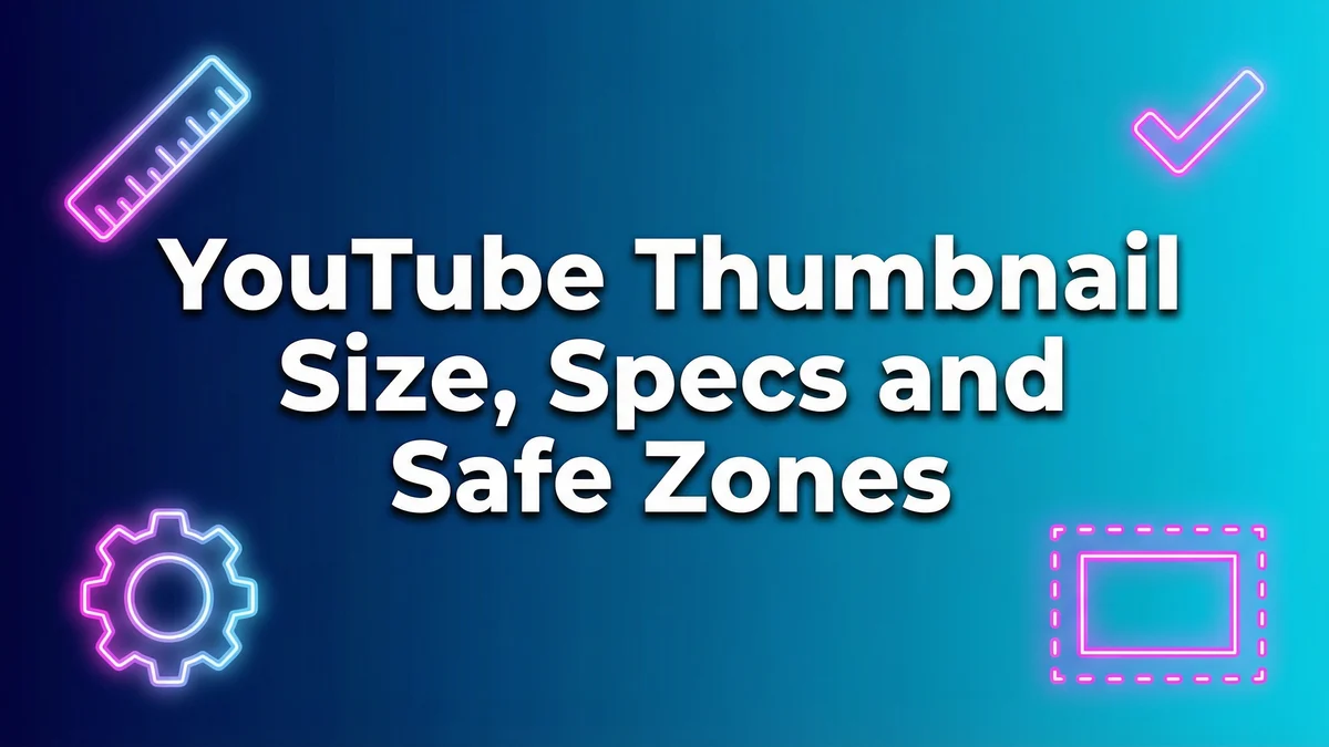
YouTube remains the thumbnail gold standard with its 1280x720px resolution and 16:9 aspect ratio. Safe zones matter critically here, keep essential elements within the center 90% of the frame to account for various player overlays. The YouTube mobile app displays thumbnails much smaller than desktop, making bold simplicity essential. Duration timestamps appear in the bottom-right corner, so avoid placing critical elements there. Desktop users see larger thumbnails in search results and suggestions, rewarding higher detail fidelity.
Instagram Reels uses vertical 9:16 thumbnails that viewers select from their video frames or upload custom designs. The Instagram feed UI overlays profile pictures, captions, and engagement buttons over thumbnail real estate, requiring creators to keep focal points in the upper two-thirds of the frame. Color vibrancy performs better on Instagram due to the platform's highly visual, aesthetic-focused culture.
TikTok covers follow similar vertical formatting but with different algorithmic implications. TikTok's For You Page prioritizes watch time over CTR, meaning thumbnails matter most for profile visitors and followers browsing your content grid. Consistency in color grading and composition helps establish visual brand identity that encourages profile exploration.
Facebook Reels covers blend YouTube's horizontal tendencies with mobile-first design principles. Facebook's older demographic often responds better to clear, direct thumbnails with explicit value propositions rather than abstract curiosity gaps.
Platform-specific algorithms influence design strategy beyond dimensions. YouTube rewards CTR heavily in its recommendation algorithm, making thumbnail optimization directly tied to distribution. Instagram prioritizes saves and shares, meaning thumbnails should tease valuable, shareable content. TikTok's completion rate focus means thumbnails serve branding more than discovery.
SkySnail functions as a genuine multi-platform solution, automatically adjusting templates and export settings for YouTube, Instagram, TikTok, and Facebook while maintaining brand consistency across all formats.
How AI Is Changing Thumbnail Creation
Thumbnail creation has evolved through distinct technological eras, each expanding what's possible for creators without massive design teams.
Photoshop dominated for years, offering unlimited creative control but demanding steep learning curves, expensive subscriptions, and hours per thumbnail. Only creators with design backgrounds or significant budgets could produce consistently high-quality work.
Canva democratized access by providing drag-and-drop templates and simplified interfaces. Creators gained speed and accessibility but often produced generic thumbnails indistinguishable from competitors using identical templates.
AI-native tools represent the current frontier, fundamentally changing the workflow from design execution to creative direction. Modern AI thumbnail generators analyze your video transcript to understand core themes, emotional beats, and key moments. They generate concept options based on proven templates from your niche, integrate facial expressions from your footage or uploaded photos, and match compositions to high-performing patterns.
This isn't about shortcuts or laziness. AI functions as a force multiplier that lets creators produce better work faster by handling technical execution while humans focus on strategy and refinement. A thumbnail that took 45 minutes in Photoshop or 20 minutes in Canva can reach first-draft stage in under two minutes with AI, leaving more time for A/B testing variations and iterative improvement.
SkySnail's transcript-to-concept workflow exemplifies next-generation thumbnail creation. Upload your video transcript, and the AI identifies the most compelling moments, suggests visual concepts aligned with proven patterns in your niche, and generates multiple variations you can refine. The system learns from performance data, gradually improving recommendations based on what actually drives clicks for your specific audience.
The 4K Quality Advantage
Resolution might seem like a minor technical detail compared to design strategy, but output quality significantly impacts both immediate CTR and long-term channel perception.
Modern devices use Retina, 4K, and high-DPI displays where image sharpness directly affects perceived professionalism. A blurry or compressed thumbnail signals low production value before viewers watch a single second of video. That subconscious quality assessment influences click decisions more than most creators realize.
YouTube's player and recommendation feeds display thumbnails at various sizes depending on context, large in search results, medium in suggested videos, small on mobile feeds. High-resolution exports maintain clarity across all contexts, while compressed images deteriorate noticeably when scaled.
Future-proofing matters for content libraries built over years. Videos uploaded in 2026 may still generate views in 2028 or 2030 when display standards have advanced further. 4K thumbnail exports ensure your archive remains sharp and professional regardless of future device improvements.
Most free thumbnail tools export compressed JPEGs that sacrifice quality for file size, resulting in artifacts, color banding, and edge softness. SkySnail's 4K export capability maintains maximum image fidelity while staying within YouTube's file size requirements, delivering crisp thumbnails that convey professional quality across all devices and contexts.
Common Thumbnail Mistakes That Kill CTR
Even creators who understand psychological principles often sabotage performance through execution errors that undermine their strategic choices.
Cluttered text remains the most common mistake. Trying to fit entire video titles or multiple concepts into thumbnail text creates visual chaos that's illegible on mobile devices. Limit text to 3-5 words maximum, your video title provides additional context. The thumbnail's job is stopping the scroll, not explaining everything.
No clear focal point happens when creators try to show too much. Multiple faces, competing visual elements, or busy backgrounds with equal visual weight leave viewers confused about where to look. Every effective thumbnail has one primary element that dominates attention, with secondary elements supporting rather than competing.
Wrong aspect ratios and ignoring platform safe zones waste valuable real estate. Uploading square images to YouTube's 16:9 format adds black bars. Placing critical elements in corners where player controls overlay them renders those elements invisible. Always design within platform-specific guidelines.
Neglecting mobile rendering proves fatal given that over 70% of YouTube watch time occurs on mobile devices. Text that's perfectly readable on your desktop monitor becomes microscopic on phone screens. Facial expressions need exaggeration to register at thumbnail size. Always preview thumbnails at actual display size before publishing.
Mismatched thumbnail-to-title messaging creates cognitive dissonance. When your thumbnail promises one thing and your title suggests something different, viewers feel confused rather than compelled. Alignment between thumbnail emotion, text overlay, and video title creates coherent messaging that reinforces the click decision.
Inconsistent branding across uploads prevents channel recognition. Random color schemes, varying fonts, and different compositional styles make your content library look like a collection from multiple creators rather than a cohesive brand. Viewers scroll past because nothing signals "this is that creator I liked before."
According to recent YouTube creator studies, fixing these six mistakes typically improves CTR by 1.5-3%, which compounds into substantially higher total views and recommendation algorithm favor over time.
A/B Testing and Iterating on Thumbnails
Static thumbnail strategies fail because audience preferences evolve, competitive landscapes shift, and platform algorithms change. Top creators treat thumbnails as living assets requiring continuous optimization.
YouTube Studio's test and compare feature allows direct A/B testing of thumbnail variations. Upload two different thumbnail designs, and YouTube automatically splits test them with your audience, showing each version to different viewer segments. After sufficient impressions (typically 7-14 days depending on view volume), the platform identifies the winner based on CTR performance and lets you select which to use permanently.
Third-party split testing tools offer more granular control and analytics for creators managing multiple channels or wanting faster iteration cycles. TubeBuddy and VidIQ provide thumbnail testing with smaller sample sizes and detailed demographic breakdowns showing which thumbnail performs better with specific audience segments.
Interpreting CTR data requires understanding context. A 4% CTR might be excellent for educational content but poor for entertainment. Track your channel's baseline CTR, then evaluate thumbnails relative to that standard. Look for statistical significance, small sample sizes produce unreliable results. Run tests until each variation receives at least 500-1000 impressions before drawing conclusions.
Test duration matters. Weekend versus weekday traffic, algorithm recommendation patterns, and subscriber notification timing all influence early CTR. Let tests run at least one full week to capture complete audience behavior patterns.
Strategy means treating every thumbnail as a hypothesis. Start with research-backed design principles, launch with your best educated guess, then let data guide refinement. The thumbnail that works today might underperform in three months. Regularly revisit high-value videos in your catalog and test new thumbnail variations as your channel grows and attracts different audience segments.
Building a Consistent Thumbnail Brand
Channel growth accelerates when viewers recognize your content instantly without reading a single word. Visual brand consistency transforms casual viewers into loyal subscribers who actively seek your new uploads.
MrBeast's thumbnail system uses consistent wide-eyed surprised expressions, bold sans-serif text (usually yellow or blue), and high-contrast compositions with vibrant backgrounds. After seeing three MrBeast thumbnails, viewers can identify his content from across the room based purely on color palette and compositional style.
MKBHD (Marques Brownlee) employs the opposite approach, minimalist compositions with clean backgrounds, centered products, and restrained color palettes dominated by blacks, whites, and singular accent colors (often red). His thumbnails convey premium quality and technical expertise through design choices alone.
Top creators develop repeatable design systems built on consistent color palettes (2-3 signature colors used across 80% of content), font stacks (one primary typeface for all text overlays), and compositional templates (subject placement, background treatment, text positioning). This consistency doesn't mean boring repetition, it means recognizable variation within established guardrails.
Avatar consistency matters for personality-driven channels. Using the same facial expression style, framing, and lighting conditions across thumbnails creates instant recognition. Educational creators often use consistent "presenter mode" headshots, while entertainment channels might use exaggerated reaction expressions as a signature element.
Template libraries enable scalable brand consistency without redesigning from scratch every time. Create 5-10 core thumbnail templates that work for different content types (tutorials, reviews, vlogs, challenges), then customize colors, text, and images while maintaining underlying structure.
SkySnail's avatar feature and template system provides exactly this infrastructure, letting creators build custom template libraries based on their brand guidelines, then generate on-brand thumbnails in minutes rather than hours. The system ensures color palette consistency, maintains font choices, and preserves compositional patterns while allowing per-video customization.
Conclusion + Call to Action
Mastering YouTube thumbnails requires balancing psychological principles, technical execution, platform-specific optimization, and continuous iteration. The creators who dominate their niches understand that thumbnails aren't afterthoughts, they're the primary gatekeeper between your content and your audience.
Start with proven psychological triggers: contrast, emotional faces, curiosity gaps, and the 3-second rule. Execute with technical precision across background composition, subject placement, minimal text overlays, and strategic color palettes. Optimize for each platform's specific requirements while maintaining brand consistency. Let AI tools multiply your productivity without sacrificing creative control. Export in 4K to future-proof quality. Test continuously and refine based on data rather than assumptions.
Ready to implement everything covered in this guide? Try SkySnail free and experience the transcript-to-concept workflow, 4K exports, and proven template library that help creators generate high-CTR thumbnails in minutes instead of hours.
Frequently Asked Questions
What size should YouTube thumbnails be?
YouTube thumbnails should be exactly 1280x720 pixels with a 16:9 aspect ratio. Save files under 2MB in JPG, PNG, or GIF format. Always keep critical elements within the center 90% safe zone to avoid overlap with player controls and duration timestamps.
How do I A/B test thumbnails effectively?
Use YouTube Studio's native test and compare feature by uploading two thumbnail variations. Let each receive at least 500-1000 impressions over 7-14 days before evaluating results. Compare CTR against your channel baseline rather than absolute numbers, and ensure tests run through complete weeks to capture full audience behavior patterns.
Should thumbnails include text, and how many words?
Yes, but limit text to 3-5 words maximum. More text becomes illegible on mobile devices where over 70% of viewing occurs. Use large, high-contrast fonts that occupy 15-20% of thumbnail height. The text should amplify your emotional hook, not explain your entire video concept.
Do I need Photoshop to make good thumbnails?
No. While Photoshop offers maximum control, modern AI-native tools like SkySnail provide professional-quality results without design expertise or expensive software. Focus on understanding psychological principles and platform requirements rather than mastering specific software tools.
Why do faces work so well in thumbnails?
Human brains process faces faster than any other visual element through specialized neural pathways. Emotional expressions trigger mirror neurons that make viewers feel emotions before consciously processing the image. This neurological shortcut explains why faces with clear emotions consistently outperform abstract imagery or text-only thumbnails.
How do I make thumbnails stand out without being clickbait?
Focus on genuine curiosity rather than false promises. Show actual moments from your video with strategic framing that creates intrigue. Use contrast and color to stand out visually while ensuring your thumbnail accurately represents your content. The goal is attracting the right viewers who'll watch and engage, not maximizing raw clicks from disappointed audiences.